Forms
Introduction
Form is a set of attributes that hold information about an object. Form is assigned to class (which is assigned to object type). When creating a form, you basically build a template that is used later for creating objects of a specific type.
How to create a form
To create a form, go to Administration > Metadata > Forms and select New Form.
First, give a name to a form and save it. This will create a form template and will open sections for configuring tabs, widgets and attributes.
If you would like to create the form with use of existing form, then you have to: 1) open existing form definition from Administration > Metadata > Forms, 2) create the new form by copying the existing; you have to choose from root form:
-3f7cf169f01be21fe1c37b3a855e3ffa.png)
3) assign new name, Save and Close. All the attributes will be copied from root to destination new one form.
General
Form Tabs
Tabs are the sections of the form. Use tabs to organize attributes into groups.
To create a tab, select New Tab.
| Attribute | Description |
|---|---|
| Name | Name of the tab. |
| Order | Position of the tab in the form (1st, 2nd, etc.). |
| Hide in new form | If checked, the tab will be displayed only after the first save of the form. |
If a form has tabs created (even a single tab), all form attributes must be placed in tabs otherwise the attributes won't be visible.
Form Attributes
Introduction
An attribute holds a piece of data about an object. It is always defined under the form. There is no global list of attributes in the system which is managed from administrative part. Attributes in different forms can use the common keys.
To create an attribute, select New Attribute.
This description below holds the example of the common properties for different types of the attributes. Specific properties for certain types are described individually for each type in: control-types
General
Here, specify the main properties of an attribute.
| Attribute | Description |
|---|---|
| Label | Name of the attribute. |
| Key | Key is a data identifier that is used in the system for mapping data and computing attribute values. |
| Control | Control specifies a type of data that can be stored in an attribute. |
| Tab | A tab in which an attribute will be placed. |
Required
Here, define whether an attribute is obligatory or not.
| Attribute | Description |
|---|---|
| Required | If checked, users will have to fill in the attribute value. An object won't be created/saved if this attribute is empty. |
| Required Expression | You can specify conditions under which an attribute will be set as required or not. For example if we would like to set up filling the defined attribute as mandatory in the case when the value of the other attribute is set up in specific way - we can use the following syntax; the example: where: typeRecTask - is the key of Select control type attribute which appoints to name of custom object type: Type of Candidates Tasks, 02INTERVl5quZl3v5uuI - is the value of the id of the certain value (Interview) of the object of this kind You can find more related usage examples in: |
| Required when status in | Single or list of the statuses values. When document gets the value of the one of statuses specified in here, then the attribute will become obligatory to be filled in. |
Visibility & Protection
In this section, define attribute's visibility and editing settings.
| Attribute | Description |
|---|---|
| Protection | Protection setting defines editing options of an attribute.
|
| Enabled expression | Should return true or false. All keys can be parsed with ${key} syntax. Lookup objects are parsed into expression as javascript objects. When true is returned then, it is possible to manipulate the value of the object (If protection lets to manipulate it). The same expression rules as in described above 'Required Expression' are valid. You can find more related usage examples in: |
| Hide in new form | If checked, an attribute will be displayed only after the first save of an object. |
| Hidden by default | If checked, an attribute will be hidden by default for all users. |
| Visibility expression | You can specify conditions under which an attribute will be visible in the form (for certain users, statuses, workflow steps etc). An expression should return true or false. All keys can be parsed with ${key} syntax. Lookup objects are parsed into expression as JavaScript objects. If it returns true, then the attribute is visible on the form. The same expression rules as in described above 'Required Expression' are valid. You can find more related usage examples in: |
| Visible when status in | The attribute will become visible if status of the document, on which form it is placed, is set up for one of the provided in here values. |
| Locked when status in | An attribute is locked and cannot be edited when the object gets at least one of the specified in here statuses. It is not recommended to use at the same time this and (one below) unlock property on statuses. |
| Unlocked only when status in | An attribute is unlocked and can be edited only when an object gets at least one the specified in here statuses. It is not recommended to use at the same time this and (one above) lock property on statuses. |
Lookup & filtering
Some control types have to look up for other objects in the system and return with a list of items or objects list view. In this section, you can define which objects will be selected.
Control types for which lookup has to be configured:
| Attribute | Description |
|---|---|
| Lookup to Object type | Your lookup list will show objects of this object type. |
| Lookup to Object class | Your lookup list will show objects of this object class. |
| Lookup key | A key of an object attribute that will be displayed in the list. Names of objects are displayed by default. |
| Group by key | The property is valid only when control type is multi-relations. Should group by provided key the available values on the list. |
| Filter | You can give an expression that filters objects by some criteria. Only filtered objects will be displayed in the lookup list. Filter should operate on destination keys. Allowed operators: ==, >, <, .IN . Partial conditions should be separated by: ; . For example:
Another example (For Select type control, for another documents object type) showing only the documents of status Active:
You can find more examples in: |
| Removable filter | When the user extends the dropdown list with available values, then the appearing list is narrowed also (in addition to 'Filter') by 'Removable filter'. At the bottom of the list there is enabled 'Show all' button. When the user presses it, then the 'Removable filter' is dropped and the values started to be displayed on the list accordingly. You can find more examples in: |
| Filter Expression | Should return true for enabling display of the values (including rules in Filter and Removable filter). If empty - it is ignored. If return false, non of the values are displayed on the list. You can use in 'Filter Expression' the values of the other keys on the same form in order to conditionally apply filtering; for trivial example if you are defining the attribute on the person form and you would like to enable filtering for certain surname, you can define the 'Filter Expression' like the following:
You can find more examples in: |
| Filter out saved value if it doesn't meets filtering conditions | This property can be useful while changing the filtering conditions and in the already created documents the value of the attribute are set according to the old filtering conditions. If this property is setup, then after changing filtering condition, saved value of the attribute is cleared out (changed to empty) in the case it does not match current filter. |
| Order by key | Your lookup list can be ordered by the certain key (attribute in destination form, view). |
| Descending order | If checked, the lookup list will be arranged in a descending order. If not, ascending order is applied (default). |
| Show 'Add' button | On the right side of the dropdown list, button with plus caption (+) is displayed. It gives the possibility to add the new value to the list and select this newly added value to the attribute. |
| Open 'New' in popup | Is visible only when Show 'Add' button is true and lookup object type is Person, all other by default will be opened in the popup. |
| Show 'Sync' button | In the bottom part of the list of values, it enables display of synchronization button, which refreshes the list. |
| Params | copyParentValuesToChildThis parameter allows to copy values from parent document and set them as initial values for children document. String can be passed in few ways just by providing the keys - 'firstName, lastName, phone, email' or in - 'parentKey=>childrenKey, parentEmail=>childrenEmail' format. Example:
Another example (when pushing the values from Candidate form when creating new employee from candidate). On Candidate from there is dropdown to Person, Employee, Name with create new button and the following parameters:
|

-87cca47a39c8bcf70336e3d390692cd8.png)

Return to:
Position
In this section you can define how an attribute will be displayed on the form.
Understanding form grid
The form template uses a Bootstrap grid to manage the arrangement of attributes in the form. The grid is divided into 12 columns and can have infinite number of rows. Each attribute you create has a width (number of grid columns it takes up) and must be placed on a certain row. You can also place several attributes on one row. An attribute as a grid element is composed of a label and a value field and both have their own width.
| Attribute | Description |
|---|---|
| Row | A row of the grid on which the attribute will be placed. |
| Sequence | You can place several attributes on one row. In such case, specify the position of an attribute (1 for 1st position, 2 for 2nd position, etc). |
| Size | Size is a number of columns an element takes up. By default, the single attribute on a row takes up the entire space (12 columns), but you can modify that. When there are several attributes in one row, specify how many columns each element takes up (e.g. 6 columns each when there are two elements in a row). Note that when there are several attributes on a row, each attribute's space is further divided into 12 columns to define its 'Label Size' and 'Value control size'. |
| Offset | An offset is a space (quantity of empty columns) between the position where attribute label is displayed and its starting position by definition (taking into account Size and quantity of the attribute in the same row and their sequence . Offset is measured in a number of columns. Default offset value is 0. Offset is not consuming from the Size, but is added on the top; for example if you have 2 attributes placed in the same row and Size of each of them is 6, and after that you will add the Offset to 1 of these for 1, then they will stop fitting in both the same row as the Offset is added on the top of Size. In order to fit them again into the same row, you have to define their Sizes as 5 and 6 in the above example. |
| Label Size | Indicates how much space (number of columns) the attribute, label takes up. Default size is 3. Please remember that no matter, how many attributes are placed in the single row and what are their Size-s, for each attribute it's Size is split by 12 columns to be used by : 'Label Size' and 'Value control size'. |
| Label hidden | If set, the label of the attribute is not displayed. It is often used for 'Relation view' or 'Children' type of control attributes which have their own url on the top to create new items. Then, it is used in order to prevent 'effect of overwhelming information'. In such case, often property 'Legend' - in 'Help' section is used instead. The effect is to present the attribute like in new section, where the Legend is playing role of 'section label', for example:
|
| Value control size | Indicates how much space (number of columns) the value field takes up. Default size is 9. Please remember that no matter, how many attributes are placed in the single row and what are their Size-s, for each attribute it's Size is split by 12 columns to be used by : 'Label Size' and 'Value control size'. |
-8eb8d705b9ffdcb16c75cac54ab3484c.png)
Value
In this section you can set a default value for an attribute or write an expression that computes a value of the attribute with defined rule (once / always).
| Attribute | Description |
|---|---|
| Default value | Use expressions to display default value in attribute.
Please find more relevant examples in: |
| Expression | Use JavaScript to write an expression that computes the returned value. All dependant keys can be parsed with ${key} syntax. Lookup objects are parsed into expression as javascript objects. It is crucial that returned value should be provided in appropriate format depending on the Control type. Also syntax differs from Default value definition, for example, for returning value of Text type of Control, expression should be defined as:
Please find below this table the expressions examples. Please find more relevant usage examples in: |
| Calculation type | How frequently the 'Expression' should be calculated (Always / Once). If not filled, calculates with Always method. If the attribute is not of 'Read Only' Write method, then when the value of the attribute is changed manually, then Expression (even in the case when setup as Always) is not overrides the manually inserted value. |
| Include into detailed search | If it is marked, then value of this attribute is taken into account while performing the detailed search:
|
-acf47cf094ceb67c69691c21e7df2b20.png)
Expression examples:
The following example correctly return value for Controls: Text or Number:
// to display total amount incl VAT
var numb = ${totalAmount} + ${vatAmount};
numb = numb.toFixed(2);
return numb;
The below example demonstrates how to return the value for Select type of Control (key = status) for object type : Status, class (empty), key: name. This is the situation where on the form we have 2 attributes of Boolean type: Completed (key = completed) and Canceled (key = canceled). Depending on the values of these 2 attributes system calculates the value of the returned Status, Select type of Control. If Canceled is marked, then it returns Canceled value in the format of full json syntax. Otherwise it sets the status depending on markup of Completed attribute. The Expression for Status (Select type of Control) is:
if (${canceled}===true) {
 return {"id":"STHQRdmCURyitAXQTJL5", "name":"Cancelled", "objectTypeId":"_statuses", "classId":"_statuses_class"};
} else
{
if (${completed}===true) {
 return {"id":"1L4plQ7XGA7kLFnD2Fcm", "name":"Completed", "objectTypeId":"_statuses", "classId":"_statuses_class"};
} else
{return {"id":"dknj94yv7Y84kubwH5Rl", "name":"Active", "objectTypeId":"_statuses", "classId":"_statuses_class"};}
}
You can find more related usage examples in:
#attribute-default-value-expression
Help
In this section you can create any contextual and UI-related help items that will assist users in navigating the system and filling in data.
| Attribute | Description |
|---|---|
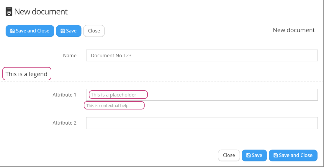
| Legend | A heading for an attribute or group of attributes. Use it to visually group attributes that are related in some way. |
| Placeholder | Enter a placeholder text for an attribute. This text will be written inside attribute field and will disappear when a user will start entering text. Use it to hint a user what data has to be entered. |
| Contextual help | Here you can provide any information that will help users to fill in data correctly. This text appears right under an attribute field. Select Open editor to open a WYSIWYG editor. |
| Description | Any additional info about the attribute. This text won't be visible for users. Use it for your own reference. This part is often to store the samples of the code used for Expression or Default expression, especially in the situation the consultant changes the Expression value and stores in here so far used value. |
Examples
How to write Form Attribute Visibility Expression?
Visibility expression to lookup field:
// Start>
var businessTripDuringNonworkingDays = '${businessTripDuringNonworkingDays}';
var show = (businessTripDuringNonworkingDays === 'Yes, I will work and I want double payment') ||
  (businessTripDuringNonworkingDays === 'Yes, I will work and I want day off') ||
  (businessTripDuringNonworkingDays === 'Yes, I will not work on non-working day(s)');
return show;
//end<
Advanced
Widgets
Widgets are small snippets of information from other areas of the system. You can add any number of predefined widgets to your form.
To add a widget, select New Widget.
| Attribute | Description |
| Label | Name of the widget. |
| Type | Select one of the predefined widgets (see List of Widgets below). |
| Tab | Select the tab in which a widget will be placed. |
| Hide in new form | If checked, a widget will be displayed only after the first save of the form. Widget won't be visible when you open a new form to create an object. |
MAPPING & PARAMS
For key mapping and parameters, please contact system administrator.
POSITION
For position settings, see descriptions in Form Attributes section.
LIST OF WIDGETS
- Who Out
- Leave Days
- Leave Remaining
- Sick Days
- Bradford Factor
- Login Info
- Ledger Info
- Budget Info
Validators
Validators are the mechanism of checking for the certain form, specific condition defined in the Expression and returning the user message when the condition is met. The returned message is displayed in top part of the form:
-5d00f17bc363b3a44b91ea4e1fed3059.png)
Validator properties:
Message - Text of message to be displayed, when expression is returns true,
Type - Warning / Error
When the Type of validator is Warning - then the message is displayed In yellow (orange) background and it is possible to perform save action on document, over which validator is triggered.
When the Type of validator is Error - then the message is displayed In yellow (orange) background and it is NOT possible to perform save action on document, over which validator is triggered.
Expression - should return true (to trigger the message display) or false
You can find more examples in:
Validator Expression Validator Expression
Built is function - should be skipped when creating own logic in Expression. For uniqueness checking it is recommended (instead of using, in here described, form validator) to setup the keys to be checked in Class definition in Advanced tab, property 'Unique keys to validate' (if you define and few keys, do not use space like: 'Unique keys to validate'=vacancyId,candidateId)
Hide in new form - is not launching validation on new document creation (before the first save) which uses the form,
Show warning on active task only - if set, validator is trigerred only in the case the there is active task related with document